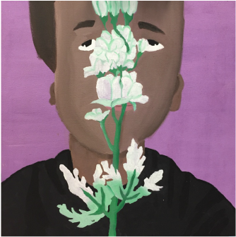
Life in light shades By Wilfredo menendez
|
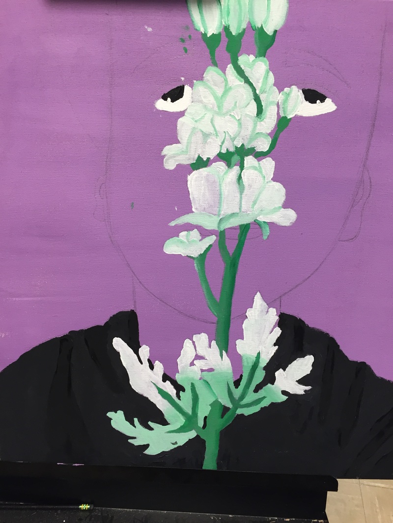
Exhibition Text: This piece is the first of my senior year, so I wanted to use it to represent a new beginning within myself. I wanted to show maturity and a more calm passionate self.
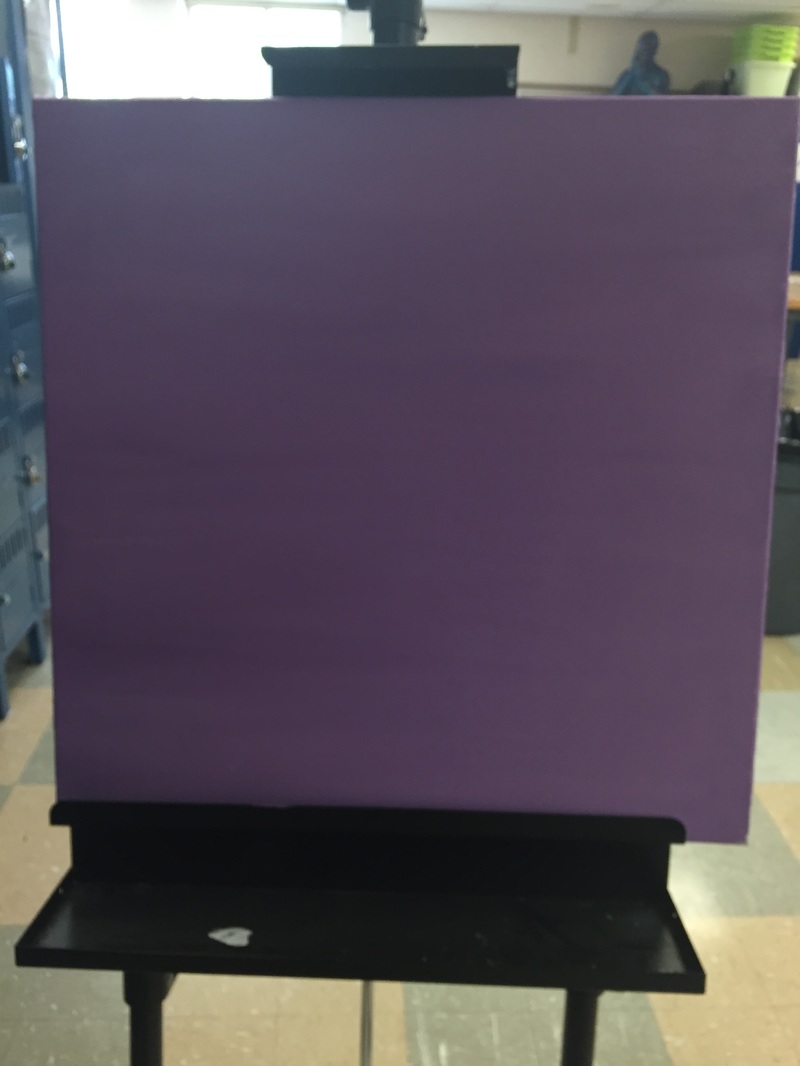
Completed: August 2016 Measurements: 24 inch x 24 inch (60.96 cm x 60.96 cm) |
Meaning: This piece is meant to show maturity. I wanted to show how I have matured to become more of a deep, focused person. Many people that know me, know me as a mainly loud, easily distracted, overambitious person, but I feel like recently I've been growing to be a more focused person that knows what his specific goals are. Not that how I was before was bad but, when it came to actually accomplishing things it wasn't ideal.
|
The Seasons by Mucha: When thinking of what art style or artist blended in with the picture that I used to draw the sketch for my self portrait, I thought of Art Nouveau. When looking through list of artist from this movement the one that I noticed that used a similar style to the one I wanted to use was Mucha. Then when looking to his pieces I looked for one that would provide me with guidance on how to draw the vegetation using this style. This piece showed me wether I should use bright or dull color, or if I should keep attention from the shadows/highlights or exaggerate them. I think this piece is perfect for this mainly since it shows different types of vegetation and poses.
Another thing that attracted me towards this piece is that unlike some of |
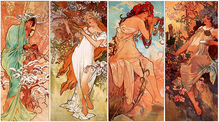
The Seasons by Alphonse Mucha
Mucha's other pieces such as his "Job Cigarette Papers" this one lacks the black outlines. So its seems more realistic and therefore more fitting for a self portrait of the sort
|
|
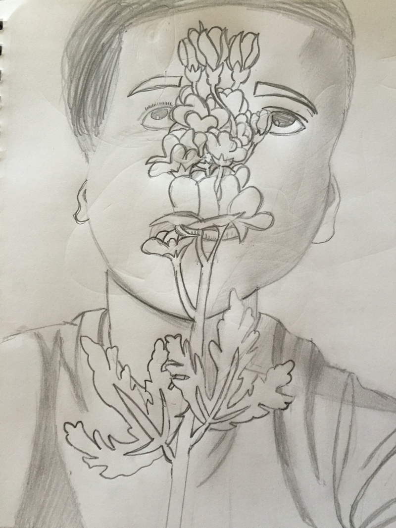
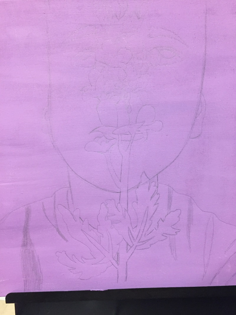
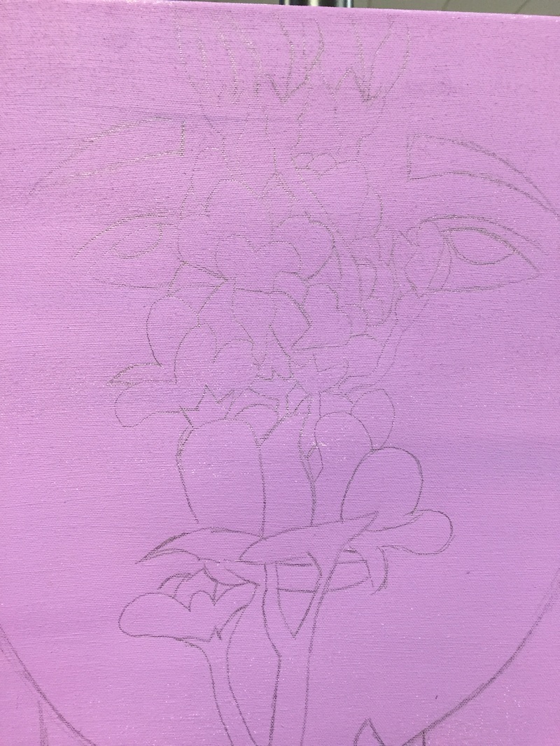
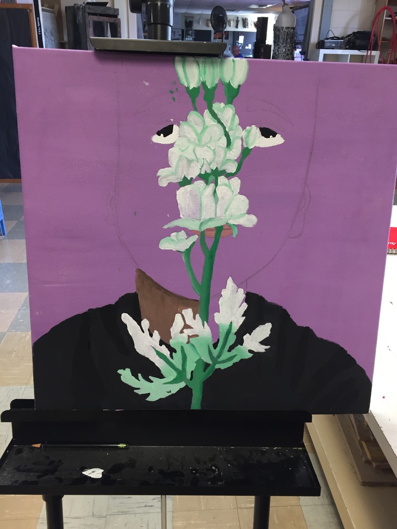
Process/Reflection: When I made my first self portrait last year I started it as a Mucha piece but I couldn't paint the style correctly so I switched it into a abstract painting. One of the main mistakes that I made the first time was the dimensions and overall sketch of myself. I didn't have much practice drawing human figures and even less in detailed faces. To fix this I used the summer project as an opportunity to practice drawing detailed faces along with other styles of faces that I wanted to use during the summer. Now during my second try at a Mucha piece I choose one in which I didn't have to spend most of my time working on the border of the piece. Last time I spent so much time trying to do the border around the picture that when the due date was really close I still wasn't done with the border. Also, since I haven't practiced drawing or painting bodies and clothing to make them look realistic, I decided to stick to my element and just do from a little bit below the shoulders and above. Something that I think I still need to work on is on making skin colors. When I first started painting my face I had made a color that seemed okay but when it dried it looked way to dark. That's something that I have noticed about acrylic paints, when they dry the tend to become duller and darker. Another thing I noticed when making skin colors was that it's better, at least for getting my skin color, to use orange instead of red and yellow separately. It's something that you would think |
wouldn't matter but surprisingly makes a big impact. Also the kind of orange you make matters a lot, from experience I can advice that when making orange for skin color make orange that's leaning towards looking more yellow than red. When I made the mistake of using neutral orange instead of yellow orange my painting ended up looking like I was painting a pumpkin person. I find most of my experiences making skin colors and painting people in the past as very comical.
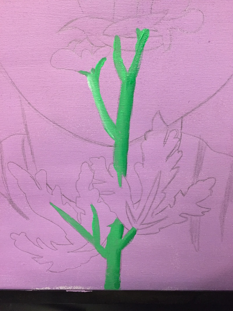
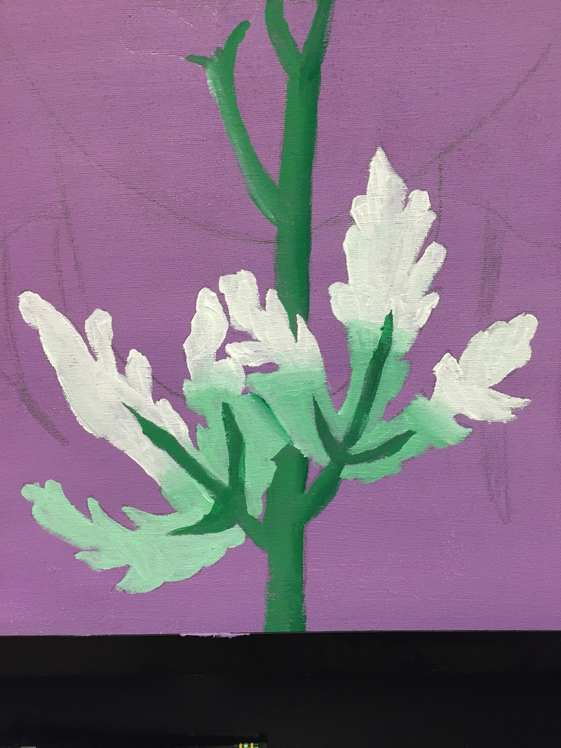
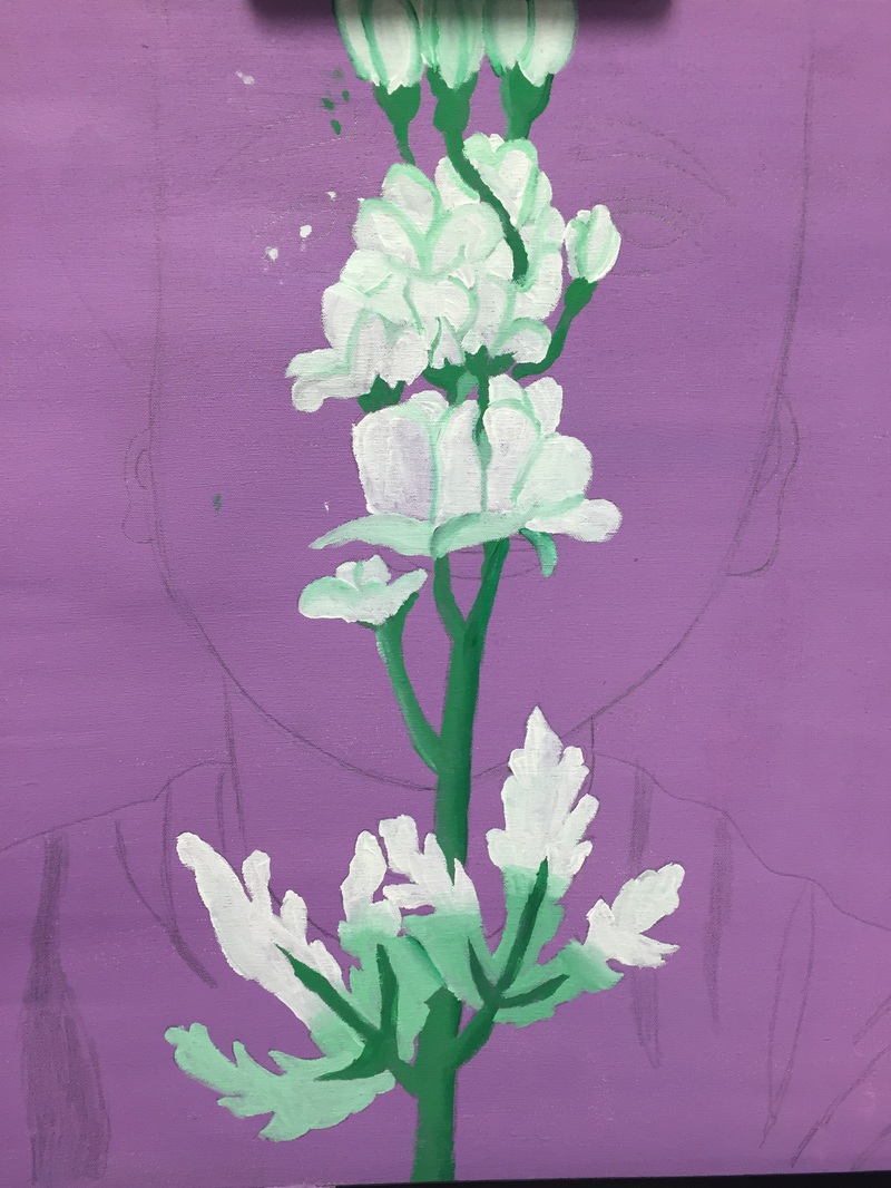
To focus more on what I did right versus what I had to fix I want to talk about the flower. Something that I think benefited me greatly when painting this is that I actually had the flower in front of me rather than just having a picture. When painting the flower I kept reminding my self that objects don't have outlines just shadows and I used this reminder to help me make it so that you could actually tell the different pedals apart in the piece. I also reminded my self that not all shadows are black or gray, most of them are actually just darker hues of the original color. For example, the flower was a pale light green color, so I decided to make the shadows just a little darker pale green. |
ACT Questions:
1.) I can see effects from my research on my work in the style of the piece. The use of soft colors and detailed flowers are directly derived from my research that thought me how to do the shading correctly.
2.) Mucha uses a mix between realistic and beautifying painting styles. This goes for both human subjects, as well as for other objects in his works.
3.) From my research I can generalize that the Art Nouveau Movement looks to beautify the subjects of it's works. Also, that they rely on light position and color to do so.
4.) The main thing I wanted out of my research was not just to find an artist to use as inspiration. But rather be able to learn the artist's unique style.
5.) I came to the conclusion that Mucha and other similar artist didn't use the exact colors they were seeing. As a result of this, I did the same thing, I used lighter/brighter colors than the ones I was seeing in real life.
Word Count: 926
Research:
Mucha, Alphonse. The Seasons. 1896. Mucha Museum, Prague. The Art Story. THE ART STORY FOUNDATION. Web. 23 Aug. 2016.
Research:
Mucha, Alphonse. The Seasons. 1896. Mucha Museum, Prague. The Art Story. THE ART STORY FOUNDATION. Web. 23 Aug. 2016.
