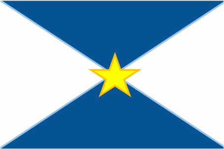
Exhibition Text: Milwaukee has been called by Forbes and other prominent news/research institutions as the fresh water Capital of the world and as a leader in water related technologies. This flag is meant to represent this recent outburst in water related technologies in Milwaukee. Milwaukee was formerly a industrial city, but know it has a promising future in supplying fresh water to states that desperately need it.
|
Symbolism:
There were many things that I wanted to represent. I used the blue to represent the lake and the role it plays in the cities rise in water technologies. The light blue that surrounds the darker blue is meant to represent the rivers that run through our downtown. The reason why I made that color hard to detect is because, many of us take those rivers for granted. The white parts of the background is used to represent the things that our city is doing to help the rest of the country. This year California has been suffering a devastating drought and it's cities like ours that are helping Californians have drinking water. Now the star in the center represents two things. The outline around the star represents our geographical location, we're in the South East corner of the state connecting with both the Lake and with Illinois which makes us a major spot for tourist coming from Illinois. Now the star itself is there to represent the fact that we are the most populated city in our state. Inspiration: As inspiration for this flag I used the Scottish flag which uses what they call St. Andrews cross. I used a very thin St. Andrews cross, which is light blue in between the white and navy blue triangles. I used St. Andrews cross to represent the smaller bodies of water in our county and also the diversity of Milwaukee. Not only racial, but socioeconomic diversity too. Milwaukee is a city that is very diverse yet divided at the same time which is why the St. Andrews cross divides the flag into four sectors. In Milwaukee you have the North Side, South Side, East Side and West Side, each of these parts of the city is know for having a specific group of people that are almost always from a specific racial group or similar socioeconomic situations. I really want this flag to help us unite Milwaukee, this division is hurting our city. Crime has gone up in the recent years, even though nationally it has fallen letting us know that something has to change. |

|
|
Process and Reflection:
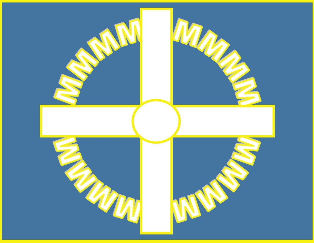
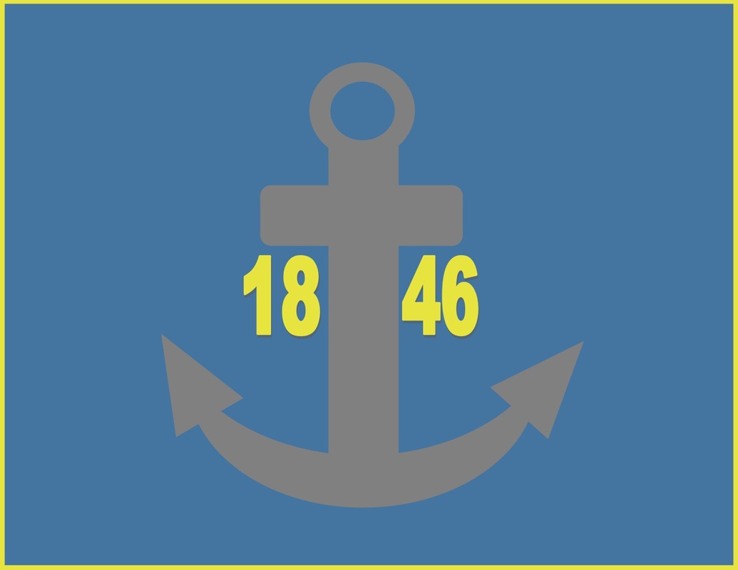
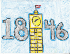
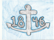
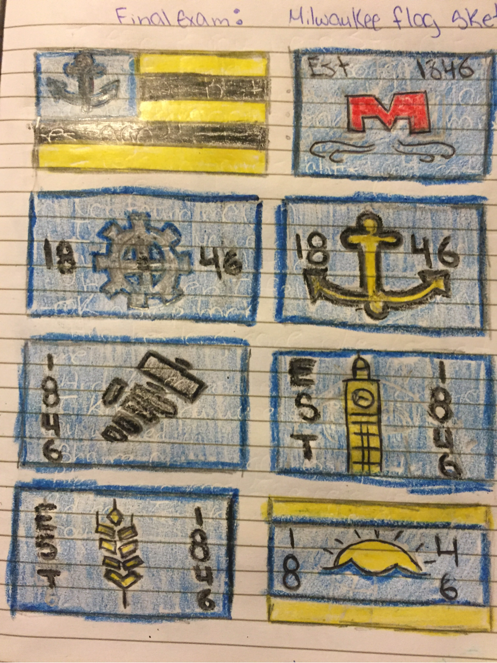
One of the things that I noticed in most of my early prototypes is that I didn't take into account that numbers look odd on flags due to the fact that they're not reversible in a flag setting. Another thing is that I focused way too much on the industrial past of Milwaukee. It is true that in the time before during and a bit after WW2 Milwaukee was an industrial city, but that is just not the case anymore. So, I decided to mix the gear for industry with our county logo and that's where the gear made of M's came in. Then, afer that I decided to focus more on our wards, but those aren't significant either we are next to a lake not an ocean so it's not like we're a prominent shipyard town. After speaking with the instructor from MIAD I decided to research more into the present of Milwaukee. Immediately I found a article by Forbes that spoke of how Milwaukee is a prominent leader in water technologies. This is the future of our city so I decided to |
|
|
get away from the past and present, and focus more on what is coming. This is not the flag of the Milwaukee we know, this is the flag of the Milwaukee we will know.
|
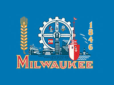
The Old Flag: Something that I took from the previous Milwaukee flag was the color and the emphasis on our lake. I knew that I had to use a shade of blue to represent our fresh water, which come from our lake. So I used the blue in my flag to represent the lake. Another reason I used the blue was more aesthetic reason, the sort of royal blue used in the old flag is a great background and it goes well with colors like gold and white. Something that the old flag had that I wanted to stay away from was how many different things it had. There was way too much detail, for other pieces of art detail is encouraged. However, a flag is seen from far away so you want the elements you have in it to be recognizable from a distance.
|
|
Word Count (Not Including the Exhibition Text ): 719
Research:
Steffan, Fred. Milwaukee Flag. 1954. Worst Flags In America. Web. Nov.-Dec. 2015.
Unknown. Flag of Scotland. 1542. Flag of Scotland. Web. Nov.-Dec. 2015.
Research:
Steffan, Fred. Milwaukee Flag. 1954. Worst Flags In America. Web. Nov.-Dec. 2015.
Unknown. Flag of Scotland. 1542. Flag of Scotland. Web. Nov.-Dec. 2015.
